PULSE Miami 2013
Shoshana Wayne Gallery is pleased to invite you to visit Booth A-100 at PULSE Miami, Thursday, December 5th through Sunday, December 8th. A select group of works by Zadok Ben-David, Kathy Butterly, Jeffrey Gibson, Rachel Lachowicz, Dinh Q. Lê, Izhar Patkin, Elaine Reichek, Michal Rovner, Beverly Semmes, Kiki Smith, and Shirley Tse will be on view.
News
Rachel Lachowicz featured in the LA Times
Review: Rachel Lachowicz gives gender roles an intriguing makeover
Rachel Lachowicz’s “Particle Dispersion: Hex Triplet Pink,” 2013, Plexiglas case with eyeshadow. (Gene Ogami / Shoshana Wayne Gallery)
By Sharon Mizota
4:30 PM PST, November 14, 2013
In her latest exhibition at Shoshana Wayne Gallery, Rachel Lachowicz continues her exploration of gender roles in an unusual medium: makeup.
That choice is an unavoidable statement about gender, like Janine Antoni painting the floor with her hair dipped in Clairol, or the fact that knitting and embroidery — now ubiquitous in museums and galleries — still carry connotations of “women’s work.”
Lachowicz’s challenge is to do something interesting with a medium that comes with so much baggage. For the most part she succeeds, although at times the work can be formulaic.
The Santa Monica artist uses small, square cakes of eye shadow like mosaic tiles to create “paintings” of text and scientific phenomena. The text works, executed in a Baldessarian, sign-painter style, are perhaps a bit glib. One, a riot of colors, declares, “TRUE COLORS,” even though makeup is anything but.
Another uses shades of black, white and gray to encourage us to recombine the letters in “CONTEXT IS QUEEN” in various ways. (“Conque” is apparently some kind of software plug-in as well as a Spanish-language conjunction. Who knew?) I suppose the work feminizes the notion that context is everything, although I found it puzzling.
The show gets more intriguing when Lachowicz tackles the male-dominated field of science. “Quantum Dot with Two Electrons” is an image of a red and yellow oblong shape enclosing two white-hot centers against a flat black background. The collision of quantum physics, in which particles may occupy multiple locations at once, and makeup, in which things are often not as they seem, creates a provocative parallel between two disparate worlds.
Lachowicz also takes on geology in a series of sculptures. Arrayed across the floor in the main gallery are several large, angular, Plexiglas boxes. Tinted in neon colors, they are filled with eye shadow, this time in its loose, powder form. The sculptures resemble geodes, crystals or perhaps even gems (a girl’s best friend?), but are patently artificial, like cartoon versions of rocks. Still, their powdery innards remind us that most pigments are minerals: Why shouldn’t the rocks get a makeover?
Finally, Lachowicz turns her eye to astronomy. “Cosmos” is a richly illustrated map of constellations and planets labeled with words like “evolve” and “post-gender.” It’s corny and a tad simplistic, but its heart is in the right place, suggesting a remapping of relationships and definitions.
It’s intriguing to see this theme explored within the somewhat limited commercial palette of makeup, which has not always been a feminist’s friend.
Yet Lachowicz has created a space in which former opposites are held in tension: natural and artificial, female and male. Like electrons, they might trade places, or better yet, occupy the same space at the same time. And putting on makeup might not be just an artful, conformist lie but an evolution of sorts.
Shoshana Wayne, 2525 Michigan Ave., B1, Santa Monica, (310) 453-7535, through Dec. 21. Closed Sundays and Mondays. www.shoshanawayne.com
Dinh Q. Lê and the 2013 Carnegie International in the New York Times
Art Review
The Carnegie International Keeps Its Survey Small
By ROBERTA SMITH
Published: October 10, 2013
PITTSBURGH — The 2013 Carnegie International is a welcome shock to the system of one of the art world’s more entrenched rituals. This lean, seemingly modest, thought-out exhibition takes the big global survey of contemporary art off steroids.
With only 35 artists and collectives from 19 countries, the latest Carnegie says no to the visual overload and indigestible sprawl frequent to these exhibitions. It also avoids the looming, big-budget showstoppers — aptly called festivalism by the critic Peter Schjeldahl — for which they are known. Actually, the Carnegie all but leaves festivalism at the door: “Tip,” the immense, shambling, cheerfully derivative barrier of wood, fabric, cement and spray paint by the British sculptor Phyllida Barlow, just outside the museum’s main entrance, is probably the show’s biggest single art object. Inside, almost nothing on view dwarfs the body, addles the brain or short-circuits the senses. It’s just art. Did I mention that half of the artists are women?
The 2013 Carnegie has been organized by Daniel Baumann, the director of the Adolf Wölfli Foundation at the Kunstmuseum in Bern, Switzerland, and Dan Byers and Tina Kukielski, two Carnegie curators. It may contribute to its deviation from convention that the curators have little experience with big surveys and don’t belong to the international curatorial cartel that circles the planet.
Their selections often evince a gratifying affinity for color, form, beauty and pleasure, and a lack of interest in finger-wagging didacticism. They have appended to their show an impressive newly installed display of Modern and contemporary works from the museum’s permanent collection that highlights acquisitions from the previous Carnegie Internationals (and includes a boxy, tilted, very red and much stronger piece by Ms. Barlow).
The show itself accounts for much of the tangled strands of today’s art, with emerging artists under 35 in the slight majority, and somewhat older ones adding ballast. There is space for occasional mini-retrospectives, including a sizable gallery filled with nearly 35 years of text pieces, photo works and bright, diminutive riffs on Russian Constructivism by the mercurial Conceptualist Mladen Stilinovic. A group of 19 increasingly robust paintings by Nicole Eisenman traces the evolution of her incisive reinterpretations of early Modernist figuration and mingles with new plaster sculptures. For example, “Prince of Swords,” a large male figure with hands blackened by an overused smartphone sits on a plinth usually occupied by plaster casts in the museum’s collection.
A cache of 57 undulant visionary landscapes by the American Joseph Yoakum (1890-1972) and 10 finely textured, scroll-like drawings of phantoms by the Chinese Guo Fengyi (1942-2010) — both formidable outsider artists — are included as if it were no big deal. The distinction was rendered moot by the extraordinary insider-outsider pileup of “The Encyclopedic Palace” at the Venice Biennale. Yoakum may qualify as the greatest artist in this Carnegie simply because his art has stood the test of time the longest.
Outstanding among the less familiar artists are two Iranians. In the 1960s and ’70s, especially, Kamran Shirdel (born in 1939) made effortlessly structural, quietly subversive films, intended as propaganda, that were often banned by both the regime of the Shah, which commissioned them, and that of its Ayatollah successors. Rokni Haerizadeh, 40 years younger, lives in exile in Dubai and has an unerring gift — shaped by Persian painting and perhaps by Goya and Art Spiegelman — for reworking found photographs into disturbing, if often beautiful, animations. His subjects here include the 2009 Iranian demonstrations and Britain’s latest royal wedding.
Less expected is “The Playground Project,” a show-within-the-show organized by the Swiss writer and urban planner Gabriela Burkhalter. Its dense history of postwar playground design — possibly better as a book — culminates in a wonderful assortment of art from the Carnegie’s annual art camp for children. This summer’s used teaching plans devised by the artists Ei Arakawa and Henning Bohl, who also contribute a playground-focused video. Though the Carnegie has no stated theme, the excellent catalog places emphasis on play as essential to art and life; “The Playground Project” gives liberating experiential form to its thesis.
This Carnegie International exposes the supposedly great divide between object-oriented or, as some would have it, market-driven art, and activist, socially involved art and suggests that they are not nearly as mutually exclusive as often supposed. To one side are the audacious computer-generated abstract canvases of Wade Guyton and the equally innovative handmade plaster and casein tabletlike abstractions of Sadie Benning, as well as the richly colored sculptures of Vincent Fecteau, which negotiate a new literally convoluted truce between the organic and the geometric.
On the other are Mr. Arakawa and Mr. Bohl’s art-camp collaboration and the especially inspiring social activism of Transformazium, a three-woman collective that relocated to Braddock, just outside Pittsburgh, from Brooklyn six years ago, determined to make a difference. Their latest effort, part of the Carnegie show, is a permanent art-lending service in the library of this recovering town, stocked with works donated by the other artists in the Carnegie, local residents and Transformazium friends across the country.
But the exhibition repeatedly illuminates the ground where form and activism overlap. In addition to the films and animations of Mr. Shirdel and Mr. Haerizadeh, this area includes Zoe Strauss’s small, remarkably lively color photographs of local residents in Homestead, another struggling Pittsburgh-area town. Also here are Zanele Muholi’s imposing black-and-white photo portraits of South African lesbians and transgendered people, and the striking welded steel assemblages of Pedro Reyes, from Mexico, which turn out to be amazing percussive instruments, even as you realize that they’re made from deactivated guns. Henry Taylor’s implacable paintings of African-Americans and Sarah Lucas’s stuffed-pantyhose sculptures of brazen women are confrontational in both medium and message.
This exhibition attests to the health of object-making of all kinds and also to art-oriented activism, as in the Arakawa/Bohl art classes and Transformazium project — suggesting that play is the crucial, underlying connection. But it points up the hazards, if not laziness, of curatorial intervention and appropriation of other artists’ art. Paulina Olowska has put on view some puppets from a once-flourishing Pittsburgh puppet theater; their intensity makes her photo-based paintings look wan. Gabriel Sierra paints the museum’s Hall of Architecture deep purple to little effect, other than evoking the Brooklyn Museum’s installation missteps. And Pierre Leguillon strews 30 pots by the great ceramic artist George E. Ohr (1857-1918) around a Hirst-like vitrine, along with Ohr’s zany promotional photographs. This is not art, it’s art abuse, especially painful since Ohr is as great as Yoakum, whose wall of drawings is adjacent.
The exception is a display of 100 pencil and ink drawings made by North Vietnamese artists during the Vietnam War that the Vietnamese artist Dinh Q. Le is presenting, accompanied by his poignant documentary about some who are still living. They speak for themselves on film, as do the quick, deft ink or pencil renderings of soldiers and civilians on the wall, which fuse Eastern and Western traditions with personal expression, functioning as document, artifact and art.
The 2013 Carnegie International remains on view through March 16 at the Carnegie Museum of Art, 4400 Forbes Avenue, Pittsburgh; (412) 622-3131, carnegieinternational.org.
Elaine Reichek featured in the New York Times
Art Review
The Jewishness Is in the Details
By KEN JOHNSON
Twenty years ago, the Jewish Museum commissioned Elaine Reichek, the artist known for embroidered and knitted social commentary, to create an installation about being Jewish. What she produced and exhibited in 1994 was “A Postcolonial Kinderhood,” an exceptionally savvy and elegant instance of identity politics in art.
Now, with “A Postcolonial Kinderhood Revisited,” the museum is reprising that exhibition with some minor additions. A pair of bulletin boards display reviews, letters and other materials documenting the original show, and a beguiling short film made from flickering home movies of Ms. Reichek’s in-laws on their honeymoon in 1934 is shown through a porthole in one wall, along with the sound of a piano playing “Somewhere Over the Rainbow.”
But the basic production, which the museum owns, is the same. It resembles a Colonial-era room in a historic-house museum. Framed needlework samplers hang on walls painted grayish green, and a four-poster bed stands in the center on a braided rug. There are also framed groups of snapshots of a well-to-do family, dating from the mid-20th century. You understand that what is actually being evoked is the lifestyle of a modern family whose ancestors might have arrived in the New World on the Mayflower. The antique furniture (in reality, reproductions purchased for the exhibition) has presumably been handed down from one generation to the next ever since. There’s a child-size rocking chair stamped with the Yale University coat of arms, signifying, no doubt, a legacy of Ivy League graduates.
Further inspection peels back another layer. In one corner of the room, there are white hand towels hanging on a drying rack, each embroidered with a monogram made of the letters J, E and W. The samplers, you discover, have stitched into them quotations contributed by Ms. Reichek’s relatives and friends. One advises: “Don’t be loud. Don’t be pushy. Don’t talk with your hands.” More seriously, another reads: “I used to fall asleep every night thinking of places to hide when the SS came. I never thought this was in the least bit strange.”
This is the story of a Jewish family so determined to assimilate into American high society that it almost entirely erases evidence of its own ethnic heritage. Indeed, Ms. Reichek grew up in just such a family and married a man from a similar background. But you don’t have to know the autobiographical details to get the point.
The implicit lesson is that there is a price to pay for hiding certain parts of yourself. What is repressed on the outside may come back to haunt you and your descendants on the inside. Someone brought up in such circumstances might feel a secret, three-pronged shame: shame for pretending to be something you’re not; shame for being something that mainstream society regards as repulsive; and shame for lacking the courage to be publicly what you really are, whatever the prejudices of the dominant culture.
Identity understood from this perspective verges on the sacred. That people should honor their ancestral traditions and not turn their backs on them is an ancient imperative. In the industrialized West of the 1960s, romanticizing ethnic, racial and other sorts of identity was part of the countercultural reaction against the soulless 1950s, when everyone wanted to be like everyone else.
One of the virtues of Ms. Reichek’s installation, however, is that it doesn’t hammer home a message but instead leaves questions hanging. You might wonder, for example, what would a room representing a family that had not suppressed its Jewishness look like? What if Ms. Reichek had grown up in an ultra-Orthodox family?
You might also question a notion of identity that takes ethnicity as essence. Is the truth of who and what you are inseparable from your ancestry? How deep does Jewishness — or blackness or Asian-ness — go?
Historically, there have been good reasons for disguising or rejecting traditional identity. If you live in a society that regards your kind as inferior and unworthy of opportunities afforded its own, it may be pragmatic to unburden yourself of that part of you and pass if you can — a big if for some minorities — as a member of the dominant group.
In a more positive sense, many people have come to this country partly to enjoy the freedom to reinvent themselves. Why not change your name, religion and whatever else in your profile that might impede you in your new home?
These are complexities and contradictions that Ms. Reichek’s installation doesn’t try to resolve, and they give it a resonance that a more didactic work would lack. But those contradictions might be among the reasons that identity art has faded for younger artists, who evidently are suspicious of identifying labels and the limiting expectations that can accompany them. Freely changing identities, putting them on and off like clothes, may be the order of the day, if Miley Cyrus’s appropriation of signifiers from black hip-hop culture is any indicator. The political energy stirring art society today is different and more pointed. Now it’s all about money.
“Elaine Reichek: A Postcolonial Kinderhood Revisited” runs through Oct. 20 at the Jewish Museum, 1109 Fifth Avenue, at 92nd Street; (212) 423-3200, thejewishmuseum.org.
Tony Orrico featured in the Dallas Observer for MAC PAC!
Artist Tony Orrico will bring his movement-based art to the McKinney Avenue Contemporary, first through a 30-hour performance spanning four days beginning September 11 and the next through an intensive two-day performance art workshop called Being to Begin on Saturday, September 28 and Sunday, September 29.
Orrico’s best known for his Penwald Drawings: charcoal artifacts created through performative motion. They’re composed bilaterally, with both hands and both feet acting at once. Like a printing press he moves through or across the surface of a plane, ticking graphite sticks or swishing them around in the palms of his hands – a movement that creates a sound like a stationary rowing machine. He pivots slowly with his wing span doing the work of a massive spirograph, layering lines through repetition.
His project at the MAC, Wane, falls into his new series CARBON. In it Tony abandons symmetry as a starting point and instead rips apart drywall, uses the pressure of his body to set motion to pencils, sews the debris of his deconstructions into new sculptures and finally, gets naked. It’s a life cycle creation where one action’s energy bleeds into the next; art is visible in both the shape of doing and the output of what’s been done.
A project of this scale is a big deal for the MAC. In fact, it represents the first sponsored exhibition coordinated by its young adult member’s program The MAC PAC, which has raised the needed funds for Orrico’s performance. To help bring the weekend workshop to life, a Kickstarter was made. (It’s running now, so go ahead and toss some coin in.)
If you’d like to do a weekend study with Tony Orrico registration opens today. Pop into the MAC and register; the two-day workshop costs $20 for students and $80 for adults and runs from 11 a.m. to 5 p.m. each day.
Be sure to view Shirley Tse at the Armory Center for the Arts
The Armory Show and Tell: Shirley Tse presents Quantum Shirley
Quantum Shirley
Quantum Shirley is a framework the artist uses to produce a series of works in diverse media. Quantum Shirley weaves together personal history, New Physics, trade movement and history of colonial products (rubber and vanilla), and the geographical displacement of Chinese nationals in the last century (Chinese Diaspora).
“To escape wars and to seek employment opportunity, my mother’s family was displaced in different parts of the South Pacific and became labor force for plantations. My mother’s immediate family landed in Malaysia and found work in rubber plantations, and her cousin Simone’s family moved further to Tahiti to work in vanilla plantations. My mother and Simone met again in 1968 in Hong Kong when Simone was doing merchandising for her toy import business. My mother moved back to China only to escape it later during Cultural Revolution, when she fled to Hong Kong. Witnessing the financial hardship my mother had to bear, Simone offered to adopt my mother’s four children and me, an infant at that time. Everything was arranged for me to be sent on an airplane in the custody of the airline, but my mother withdrew the arrangement in the last minute and I stayed with her. I often wonder what my life would have been had I grown up in Papeete fostered by Simone. All Simone’s four children were educated in universities in Paris, and some are quite artistically inclined. Perhaps I would have been an artist anyway. Better yet, I believe, in a parallel world, I speak French, have lived in Tahiti, studied at École Nationale Supérieure des Beaux-Arts, and became an artist. I just simply cannot observe that existence.
“According to quantum theory, if a card falls, it falls on both sides at once. This can be explained by the ‘collapse of the wave function,’ which basically means that thing exists in many states but then collapses into one state when observed. I am intrigued by the ‘validation’ of parallel worlds, paradoxes, and the simultaneity offered by quantum physics. It is interesting that an otherwise tragic personal story can be re-interpreted. When a personal story is seen through other scientific, economic, or historical lenses, a radical change or even a reversal of values could take place.
“I [will] talk about my personal story and map the connections of it to colonial trade, China’s recent history and multiple-worlds theory…[and] show some images and videos I took in my trip to visit Simone in Tahiti, something I have not yet found form of presenting.”
Shirley Tse’s work has been included in numerous museums and exhibitions worldwide, including the Biennale of Sydney; Bienal Ceara America, Brazil; Kaohshiung Museum of Fine Arts, Taiwan; Art Gallery of Ontario; Museum of Modern Art, Bologna, Italy; San Francisco Museum of Modern Art; New Museum of Contemporary Art and PS1, both in New York; Kettle’s Yard, Cambridge, UK; and Govett- Brewster Art Gallery, New Zealand. Her work has been included in numerous articles, catalogues, and publications including Sculpture Today by Phaidon. She received the City of Los Angeles Individual Artist Fellowship, the John Simon Guggenheim Foundation Fellowship, and the California Community Foundation Fellowship for Visual Artists.
Time:
Saturday, August 24, 2013
12:45 pm - 1:45 pm
Location:
Armory Center for the Arts
145 N. Raymond Ave., Pasadena, CA 91103
Mounir Fatmi interviewed by V&A for the Jameel Prize!
Morocco-born Mounir Fatmi lives and works between Paris and Tangier. He creates videos, installations, drawings, paintings and sculptures that directly address the current events of the world. Here he explains what drives him to create these complex and foreboding works, which he intends to appeal directly to the viewer’s doubts, fears and desires.
Where the Rubber Meets the Road – Jeanne Silverthorne in the International Sculpture Center Blog
In a recent column on Vulture.com, critic Jerry Saltz quoted dealer Gavin Brown about the outsize scale of contemporary art reflecting the outsize scale of the art world: “When we are able to fly around the globe in 24 hours, and that is a common occurrence … these large-scale works might be an unconscious attempt to rediscover awe.” (Never mind that 1960s and 1970s Earth Works were awe-inspiring, supersized, and propagated in the vast landscape of the American West.) Curiously, today there is an antidote to king-size sculpture: an increasing interest in pocket-size work. Parallel to the incredible shrinking sculpture is that these pieces are handwrought by the artist. Embedded in the fast-paced, technology-based, global reach of the early twenty-first century is a simultaneous hankering for intimately created and displayed art. These little works may just be the next big thing.

Thelma, 2005. Rubber, hair and phosphorescent pigment.
4 ½ x 1 ½ x 2 ¼ inches, 11.4 x 3.8 x 5.7 cm. Edition of 10
This is a quiet counter movement by some artists who choose to make diminutive objects rather than massive ones. Matt Hoyt’s (American, b. 1975) small sculptures of hand-held, hand-crafted rocks, chain, bone or twigs were on view in the 2012 Whitney Biennial. Christiane Lohr (German, b. 1965) makes tiny plant sculptures from burrs and thistles. Charles LeDray (American, b. 1960) sews miniature suits of clothing that could fit an elf. And Jeanne Silverthorne (American, b. 1950) is using platinum silicone rubber to create figures that are small in stature but big in attitude. While Silverthorne also makes installation projects of rubber tubing that can span a gallery, her human forms are the size of a coffee cup. When her mini people are poised, seated atop a tall platform, their littleness is exaggerated.
“I really like a range from tiny to large because shifts in scale are like shifts in power,” the artist wrote in a recent email. “If you are looking at something tiny, you are in control of the object, you dominate. But if you are in a room-sized installation or facing a large object, then you are dwarfed by it, disempowered to some extent.”

Thelma, 2005. Rubber, hair and phosphorescent pigment. 4 ½ x 1 ½ x 2 ¼ inches, 11.4 x 3.8 x 5.7 cm. Edition of 10
Their stature reflects a shift in human experience in the world. When enormous work destabilizes the viewer even while enveloping him, the tabletop object offers an opportunity for quieter reflection and even some humor. “I guess there is an aversion to monumentality,” Silverthorne stated. “Somehow the grandiose gesture doesn’t fit with [my] obsession with mortality and extinction.”
Silverthorne’s little people are acutely honed in rubber because the material “was touchable, felt like flesh. It bounced and was funny.” The artist adds pintsize details to each form such as a rumpled sweater, wrinkled flesh, a smear of lipstick or a decorative bracelet. Silverthorne’s figures’ have a yellow bile hue (called “phosphorescent” by the pigment manufacturer, it enables the objects to glow in a darkened room) and she adds human hair to their heads. Through this very current material (Louise Bourgeois, Eva Hesse, Richard Serra, Mona Hatoum, Mathew Barney, and Chakaia Booker have all used rubber in their work), Silverthorne is able to reclaim historic sculptural techniques including traditional modeling and casting.
She began working with rubber in the mid-1980s and has continued her fascination with the material. “It literally has no backbone… and therefore it flops around like a slap-stick vaudevillian. Also, rubber effects an ever-so-slight blurring of details, a kind of smoothing out, almost as though there is an echo of fluidity left after the pour has set,” Silverthorne explained.
Intrinsic to her use of rubber to create likenesses of people is the tension that rubber conjures; traits that are dreary, industrial, and dull. But Silverthorne makes objects reeking of vitality: human figures, thriving organic forms and plant matter. “I don’t really see it as lifeless and inanimate…” she said. “Perhaps there is a certain inertness to the material and that would certainly underscore the theme of entropy, of inevitable decay and loss of energy that runs throughout everything I do.”
LA Weekly features Yvonne Venegas
A Mexican Telenovela Spawned a Teen Pop Sensation. Artist Yvonne Venegas Documented the Insanity
By Catherine Wagley
Published June 13, 2013
In a photograph, Anahi, the actress-singer who uses only one name and plays high school superstar Mia in the Mexican telenovela Rebelde, stares at the camera with an expression that looks severe and defiant but probably just reflects the tedium of in-between moments like this one. She’s beside the flawlessly white hospital bed of Miguel (Alfonso Herrera), her father’s onetime enemy, her sweetheart and her bandmate on the show. Because of the coma into which he has mysteriously fallen, literally toppling over midsentence in an earlier scene, he lies with head back and a clear oxygen tube looped under his nose. Shooting has not begun, so cast and crew bustle around the two stars, fidgeting with balloons and cake for Miguel’s birthday party, throughout which he will remain unconscious.
Anahi is incandescent, as usual — something about the way light hits her layered, product-heavy blond hair and made-up skin really does make her glow. Though in this moment, when she looks the part of Mia but isn’t actually playing it, you take her more seriously than you would seeing her on a TV screen, saying something like, “Miguel, baby, I have so many things to tell you” through tears that don’t redden her face.
The photograph, called Cumpleaños (Birthday), belongs to artist Yvonne Venegas’ series Inedito (Unpublished), which features in Venegas’ second solo exhibition at Shoshana Wayne Gallery in Santa Monica. The series was unpublished for six years, finally appearing last October in a book that Venegas funded via a Kickstarter campaign and published under the RM imprint.
She took the images in 2006, during the last six weeks of filming for Rebelde’s final season, because Mauricio Maillé of the Televisa Foundation’s Visual Arts Department invited her to do so.
The department, backed by Televisa, the Mexican media conglomerate and producer of Rebelde, had just started commissioning contemporary artists at that point, and Maillé had seen an earlier series by Venegas, The Most Beautiful Brides of Baja California, depicting upper-class Tijuana women, many of whom seemed highly conscious of their own carefully composed femininity.
His loose idea was to give the photographer unhindered access to the show’s filming, with a photo book as the possible result.
“He knew there was something there. He wanted me to document the phenomenon,” says the Mexico City–based Venegas, an alumna of UC San Diego’s MFA program and the daughter of a well-known Tijuana wedding photographer.
She makes photographs with the intuitive precision of a good photojournalist, but intends them to be seen on their own, not framed by newspaper headlines or magazine captions.
She doesn’t do much posing or editing, and maybe it’s her photos’ unproduced look that caused the Televisa Foundation to forgo a book — she recently heard certain higher-ups weren’t convinced her images qualified as art — even though that look is a specific strategy. It interrupts the veneer that often surrounds her hyper-produced subjects: the brides; the regal Mrs. María Elvia de Hank, the wife of Tijuana’s wealthy former mayor, whom Venegas shadowed for four years and describes as “a subject with a clear idea of how she wanted to be seen”; or the telenovela stars.
Rebelde, a remake of an Argentine series based on an Israeli show, focuses on a group of students at a boarding school called Elite Way, where, as the name suggests, most come from money and those on scholarship must either prove themselves worthy or be ostracized.
During the show’s 2004-06 run, the six main characters formed a band, called RBD, which became a sensation beyond the show’s frame. EMI Records signed RBD and they toured Europe and the United States, releasing two live albums in addition to their six studio ones.
“This blurring of fiction and reality happened,” says Venegas, who photographed the cast both at Televisa’s Mexico City soundstage and on a U.S. tour, where young fans dressed like Elite Way students sometimes would take photographs of her as she photographed them. Her identical twin sister, Julieta Venegas, had just released 2006 album Limón y Sal, which would sell 50,000 copies in the first two days after its debut, and people understandably mistook the photographer for the musician. So she became part of the identity blurring surrounding RBD.
“I’m interested in the situation, how the photographer becomes part of the situation,” Venegas explains. “They had a dynamic that I could easily play into. There was always a distance, a respectful distance — if I didn’t have a camera, my being there would have been absurd. But there was also a closeness.”
She would go shopping with Christian Chavez, who plays Giovanni and whose hair color changes regularly, or sit with RBD members during downtime.
One image, Dulce en el Telefono, shows a droopy-eyed Dulce Maria, headstrong Roberta on the show, between shoots, wearing her school uniform — a white shirt with top buttons undone and a loose red tie — lying with her head nestled into the corner of a new-looking tan sofa; she has a pillow on her stomach and a black and yellow cellphone up to her ear. Another shows Dulce standing on a balcony poised to drop a book down on suited men while cameras in the foreground record her and a few monitors show a live black-and-white feed of her face and shoulders.
Occasionally, Venegas would photograph the industrial streets behind a Mexico City studio building or a hotel where RBD stayed while on tour, in an attempt to contrast the smoothness inside, which seemed almost ignorant of any other reality, with outside. “The view gives you an idea of class,” she says. “There are so many expectations around the subject. People expect a photographer to see it in a certain way.”
A photographer is expected to criticize when surrounded by the trappings of privilege. But that expectation is limiting and sometimes misguiding. Consider, for example, a 2006 image by photographer Spencer Platt, taken after an Israeli airstrike destroyed a Beirut neighborhood. Well-dressed young people drive through rubble in a gleaming red convertible, one woman taking photographs with her phone. Because of the stark contrast between them and their devastating surroundings, they were misidentified in print and conversation as affluent gawkers. In fact, they were looking for their home like everyone else.
Only a clear caption could have remedied this misread, which is the situation Venegas tries to avoid. Can’t an image invite a nuanced reading without relying on written explanations that detail reality’s complications?
No captions or essays appear in Venegas’ book. The image on Inedito’s cover also features in the exhibition and shows RBD members backstage in the concrete hallway of an arena. They look like the school kids they play on TV — young, slightly uncertain, distracted. The two security guards flanking them are noticeably bigger and their cosmetically enhanced, TV-star gleam seems dwarfed by the rest of the world.
“The subject is complicated and I hope it becomes more complicated,” Venegas says, referring not just to Inedito but to her work in general. “What I mean is, I want more things to seem as though they don’t make sense.”
YVONNE VENEGAS: BORRANDO LA LINEA | Shoshana Wayne Gallery, 2525 Michigan Ave., #B1 | Through Aug. 23 | shoshanawayne.com
Yvonne Venegas: The Personal View of Things
The award-winning photographer Yvonne Venegas, originally from Tijuana and now based in Mexico City, got her start at the age of 16 and took her first official photo class a year later. Her father, a social photographer in Tijuana, gave Yvonne her first camera.
Yvonne is a graduate of the certification program at the International Center of Photograhy in New York and she received her MFA at the University of California San Diego. She has shown her work individually and in group shows throughout the US, Mexico, Poland, Spain, France and Canada. Her work is part of collections in the US and Mexico, including the permanent collection of the Museum of Contemporary Art San Diego, Fundación Televisa, Centro de la Imagen in Mexico City and the Anna Abello Collection. She has published two photobooks, “Maria Elvia de Hank” and “Inédito.”
Here Yvonne discusses her latest project, for which she used the new Leica X Vario to document her father, José Luis Venegas, at work.
Q: What type of photography do you do?
A: When I started I wanted to be in fashion, then I wanted to be the Annie Leibovitz of Mexico and now I’ve been really focused on creating my own language and my own identity through my work.
Q: You usually take a couple years to do your projects. Can you tell us about your process?
A: I like to focus on one subject at a time. In 2000 I started my first long-term project and it lasted four years. I discovered I was trying to create something that paralleled my own identity. It was a wonderful experience.
I guess an important part of my process is that I’m often confused. I don’t really know what I am doing. It does parallel how I’m feeling or thinking. It is a bit abstract and hard to define in the first couple of years, but as I keep working at it, it starts to come together. I did a project called “Inédito” between 2006 and 2010 and I published a book with it. That was particularly a revealing experience because I worked on it during my graduate degree. I was living and doing the project in Tijuana and I was going to school in San Diego. I was doing the duel life of creating the work in Tijuana and then working with my fellow students and teachers and formulating something with it. My process tends to be blurry and then it comes together at the end.
Q: Tell us about your latest project documenting your father. Where did the idea come from?
A: This project is kind of a fragment of what I’ve been thinking lately. It is kind of an extension of it because I have been wanting to photograph social photographers, but I don’t know any in Mexico City. So I’ve been focusing more on the photographers I do know. When I had the opportunity with Leica, I thought it was perfect to shoot this idea but with a photographer that I have access to. I proposed it to my dad and he was very happy. It was a wonderful process.
Q: Your style is very different from your dad’s. Can you tell us the differences between how your dad shoots and how you shoot?
A: I don’t think there is another way to say it besides we are completely opposite. I am looking for moments that are imperfect or just a little bit off that make those perfect moments that he was formulating for his customers. They don’t have to be a terrible mistake where someone looks awful, but just wrong enough to make you want to throw it out and not include it in a photo album. That has been our dynamic. Unlike his perfect pictures, home life wasn’t perfect and I’ve always thought that photographing like this is a way of sort of fighting him.
Q: Can you tell us about the experience of shooting your dad?
A: It was very intense. It was seeing my dad in a later stage of his life where he is not the young man he used to be. He used to go to weddings and work 15-hour nights and then just sleep it off and be okay the next day. Now he is almost 70. It was an emotional thing to see him grow up and to see me grow up also. When your parents grow old that means you are old too.
It was a beautiful process. It had all the kind of feelings I like for a project to have. It was uncomfortable and emotional. The feeling was a bit more intense than my other projects because it was my dad. I was crying a lot and it was really odd. I would tell my dad’s customers about the project and they love him. Some of them have been his customers for 20 or 30 years.
Luckily, I got to photograph the 50th wedding anniversary of a couple and their family who have always had my dad photograph their events. When this beautiful, wealthy lady from Tijuana started to tell me about my dad and how wonderful and important it was to have him around then I see my dad photographing this private dinner party for them, I had to hold back the tears. They all obviously respected him.
Q: You’ve talked before about your father wanting the perfect picture and how that reflected him aspiring to a different social class. Can you tell us about why your father is obsessed with the perfect picture?
A: I think the perfect moment is a fantasy. My father grew up in a different circumstance than I did. His father worked for the law in Mexico in the ‘60s. So my dad had this strong conviction to have his own business, to be a stable person and send all of his kids to the best school. He was part of the building of a social class. He became crucial to a lot of people. But the way he had grown up didn’t allow him to be this perfect father so it was a bit of a tense upbringing compared to other girls. He had this idea that we were going to belong to this social class and marry rich guys and do all this stuff, but then our ideas became very different. My twin sister and I both became artists. She is a musician. The rest of my family did other things. But my twin sister and I never fantasized about marrying a rich guy or being a part of that social class. We liked to be different.
Q: How has your view of your father as a photographer changed through the years?
A: A few years ago I went into his archives and looked at all his negatives from 1972-1975 and I did my own edit of them. I plan on doing a book with them. The pictures I found were pictures that I wish I would’ve taken. A lot of people who have seen the pictures see a lot of similarities with my work. My dad as a beginning photographer was seeing things the way I see them. But then he became a commercial photographer so he started eliminating those moments that were not going to be bought. When I saw that work together I thought it was my eye as an editor, but it wasn’t. We come from the same place. I inherited something from it. It isn’t necessarily beautiful. It is a little bit dark sometimes. I also inherited how to make portraits, how to talk to people and make them feel comfortable.
After so many years of fighting with him and being pushy about things, I come back to this moment where I feel that he gave me so much. I admire how he treats people and makes portraits. I used to think they were cold and stiff, but they really weren’t. When you see his portraits compared to other photographers that follow all the same rules he does, they were alive. His portraits do have a feeling of character. I think that feeling is something I have inherited from him. Also, he is always trying to learn. I have the same feeling about my work. It is an addiction to just getting better. I got that from him.
Q: Can you talk about how using the Leica X Vario fit into your recent project?
A: I had never done a project with digital media. This was the first time. It was a surprising and refreshing experience. It was a different rhythm. Sometimes film will sit there for weeks before you develop it and look at it. This way you can look at the images as you’re working and it is like someone just sped up my process. It was exciting. I came back from this project feeling refreshed. I had this idea of photographing photographers in mind and suddenly I did it in three weeks. I edited it in four weeks. It got me really excited to do other projects. It just showed me the possibility of a different rhythm of working.
Working with a compact camera is a completely different experience. I feel like I’m in places I wouldn’t be otherwise. A compact camera is comfortable to carry everywhere. It allowed me to go into spaces that I probably wouldn’t have gone into. The image quality of the Leica X Vario is amazing. The RAW files are beautiful. It made me doubt my film addiction for a moment when I saw the RAW files from this camera.
Q: How was the Leica X Vario special for the project?
A: Working with the Leica X Vario was special for so many reasons. It was easy to bring to situations and not intimidate people with a bigger camera. It had beautiful RAW files that came out of every moment. The flash is really cute too. It’s like an alien! And you can use the Leica X Vario in manual. To get the moments I wanted, I had to shoot a lot. The camera has to shoot when I want it to shoot. I loved that about this camera because it was shooting when I wanted to. To focus manually and have manual controls was important while I was working. I was better able to be in control of the situations.
Q: Over the past 15 years you have been working on defining your voice. How would you describe your voice right now?
A: Recently I had a revision of my work from when I first started to now that made me see my work in a new light. I initially thought it was a bit of a mess and didn’t know where I was going. It made me realize that many things have happened with my work. I did a project in 2006 that was supposed to be published and shown and nothing happened with it. These things happen in my work and I just have to be patient. It shouldn’t have surprised me that people weren’t always going to understand it. After finally seeing the show and publishing the book, which both happened in September of last year, it kind of set me straight. I see this as a new beginning. It sounds corny but it’s true. It made me reflect on my past work. It made me confident and helped me find my voice.
Thank you Yvonne!
-Leica Internet Team
To see more of Yvonne’s work, visit www.yvonnevenegas.com. For details on the new Leica X Vario, visit Leica’s website.
Borrando la Línea Gallery Talk + Opening
Thanks to everyone who joined us on Saturday!
Our Upcoming Fall Artist, Jeff Gibson, Featured in the NY Times
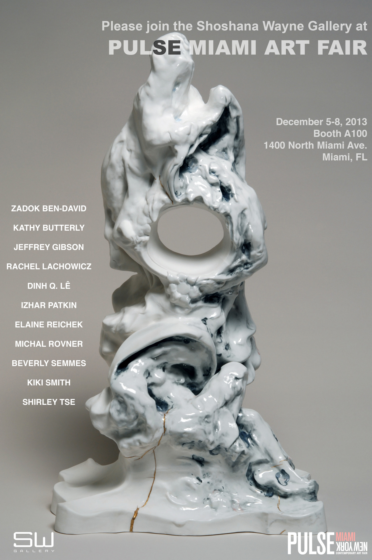
Jeffrey Gibson in his studio in Hudson, N.Y., with his dog, Stein-Olaf.
At Peace With Many Tribes
By Carol King
Published May 15, 2013
HUDSON, N.Y. — One sunny afternoon early this month Jeffrey Gibson paced around his studio, trying to keep track of which of his artworks was going where.
Luminous geometric abstractions, meticulously painted on deer hide, that hung in one room were about to be picked up for an art fair. In another sat Mr. Gibson’s outsize rendition of a parfleche trunk, a traditional American Indian rawhide carrying case, covered with Malevich-like shapes, which would be shipped to New York for a solo exhibition at the National Academy Museum. Two Delaunay-esque abstractions made with acrylic on unstretched elk hides had already been sent to a museum in Ottawa, but the air was still suffused with the incense-like fragrance of the smoke used to color the skins.
“If you’d told me five years ago that this was where my work was going to lead,” said Mr. Gibson, gesturing to other pieces, including two beaded punching bags and a cluster of painted drums, “I never would have believed it.” Now 41, he is a member of the Mississippi Band of Choctaw Indians and half-Cherokee. But for years, he said, he resisted the impulse to quote traditional Indian art, just as he had rejected the pressure he’d felt in art school to make work that reflected his so-called identity.
“The way we describe identity here is so reductive,” Mr. Gibson said. “It never bleeds into seeing you as a more multifaceted person.” But now “I’m finally at the point where I can feel comfortable being your introduction” to American Indian culture, he added. “It’s just a huge acceptance of self.”
Judging from Mr. Gibson’s growing number of exhibitions, self-acceptance has done his work a lot of good. In addition to the National Academy exhibition, “Said the Pigeon to the Squirrel,” which opens Thursday and runs through Sept. 8, his pieces can be seen in four other places.
“Love Song,” Mr. Gibson’s first solo museum show, opened this month at the Institute of Contemporary Art, Boston, with 20 silk-screened paintings, a video and two sculptures, one of which strings together seven painted drums. The smoked elk hide paintings are now on view in “Sakahàn,” a huge group exhibition of international indigenous art that opened last Friday at the National Gallery of Canada in Ottawa. And an installation of shield-shaped wall hangings, made from painted hides and tepee poles, is at the Cornell Fine Arts Museum at Rollins College in Winter Park, Fla.
Mr. Gibson also has work in a group exhibition at the Wilmer Jennings Gallery at Kenkeleba, a longtime East Village multicultural showcase through June 2. Called “The Old Becomes the New,” it explores the relationship between New York’s contemporary American Indian artists and postwar abstractionists like Robert Rauschenberg and Leon Polk Smith who were influenced by traditional Indian art. Mr. Gibson’s contribution is two cinder blocks wrapped in rawhide and painted with superimposed rectangles of color, creating a surprisingly harmonious mash-up of Josef Albers and Donald Judd with the ceremonial bundle.
The work’s hybrid nature has given curators different aspects to appreciate. Kathleen Ash-Milby, an associate curator at the Smithsonian National Museum of the American Indian in Lower Manhattan, said she loved Mr. Gibson’s use of color and his adventurousness with materials, and that he has “been able to be successful in the mainstream and continue his association with Native art and artists.” (Ms. Ash-Milby gave Mr. Gibson his first New York solo show, in 2005 at the American Indian Community House.)
Marshall N. Price, curator of the National Academy show, said he was drawn by Mr. Gibson’s drive to explore “both the problematic legacies of his own heritage and the problematic legacy of modernism” through the lens of geometric abstraction. (Which, he noted, “has a long tradition in Native American art history as well.”)
And for Jenelle Porter, the Institute of Contemporary Art curator who organized the Boston show, it’s Mr. Gibson’s ability to “foreground his background,” as she put it, in a striking and accessible way. Ms. Porter discovered his work early last year, in a solo two-gallery exhibition organized by the downtown nonprofit space Participant Inc.
“People were raving about the show,” she said. “So I went over there and I was absolutely floored.”
The work was “visually compelling, and not didactic,” she added. And because “he’s painting on hide, painting on drums, you have to talk about where it comes from.”
Mr. Gibson only recently figured out how to start that conversation. Because his father worked for the Defense Department, he was raised in South Korea, Germany and different cities in the United States, so “acclimating was normal to me,” he said. And one of the most persistent messages he heard growing up was “never to identify as a minority,” he added.
At the same time, because much of his extended family lives near reservations in Oklahoma and Mississippi, Mr. Gibson also grew up going to powwows and Indian festivals. He even briefly considered studying traditional Indian art, but instead opted to major in studio art at a community college near his parents’ house outside Washington. In 1992, he landed at the School of the Art Institute in Chicago.
There, Mr. Gibson, who had just come out as gay, often felt pressured to examine just one aspect of his life — his Indian heritage, with its implicit cultural sense of victimhood — when what he really yearned to do was to paint like Matisse or Warhol. At the same time, he was learning about that heritage in a new way as a research assistant at the Field Museum aiding its compliance with the 1990 Native American Graves Protection and Repatriation Act.
As he watched the Indian tribal elders who frequently visited to examine the drums, parfleche containers, headdresses and the like in the Field’s collection, Mr. Gibson was struck by their radically different responses. Some groups “would break down in tears,” he said. “Or there would be huge arguments.”
He came to see traditional art then “as a very powerful form of resistance” and to better “understand its relationship to contemporary life.” And nothing else he’d encountered “felt as complete and fully formed as the objects themselves,” he said. “It certainly made it difficult for me to go into the studio and paint.”
Yet paint Mr. Gibson did — mostly expressionistic landscapes filled with Disney characters, like Pocahontas, and decorated with sequins and glitter. His work continued in a similar vein while he was earning his M.F.A. at the Royal College of Art in London. Although the Mississippi Band paid for his education, the experience gave him a welcome break from grappling with concerns about identity, he said, and a chance “to just look at art and think about the formal qualities of making an artwork.” (Along the way, he also met his husband, the Norwegian sculptor Rune Olsen.)
After returning to the United States in 1999, this time to New York and New Jersey, Mr. Gibson began painting fantastical pastoral scenes, embellishing their surfaces with crystal beads and bubbles of pigmented silicone, recalling 1970s Pattern and Decoration art. Those led to his first solo show with Ms. Ash-Milby in 2005, and his inclusion in the 2007 group show “Off the Map: Landscape in the Native Imagination” at the National Museum of the American Indian, as well as other group shows.
At the same time, Mr. Gibson was making sculptures with mannequins and African masks. While struggling to understand Minimalism, he also began to see the connection between Modernist geometric abstraction and the designs on the objects that had transfixed him in the Field’s collection.
His 2012 show with Participant, “One Becomes the Other,” proved to be a turning point. In it, he collaborated with traditional Indian artists to create works like the string of painted drums, or a deer hide quiver that held an arrow made from a pink fluorescent bulb. And once he set brush to rawhide, Mr. Gibson said, he was hooked. As well as being “an amazing surface to work on,” he said, “its relationship to parchment intrigued me.”
Its use also “positions the viewer to look through the lens that I’d been working so hard to illustrate.”
But the underlying change, Mr. Gibson added, came from his decision to shed the notion of being a member of a minority group. Suddenly all art, European, American and Indian alike, became merely “individual points on this periphery around me,” he said. “Once I thought of myself as the center, the world opened up.”
A version of this article appeared in print on May 19, 2013, on page AR21 of the New York edition with the headline: At Peace With Many Tribes.
Congratulations to Kathy Butterly on the 2013 Visionary Woman Award
Kathy Butterly and Ann King Lagos to Receive 2013 Visionary Woman Award
Kathy Butterly (left) and Ann King Lagos (right)
For Immediate Release
April 26, 2013
(Philadelphia PA) Moore College of Art & Design will present the 2013 Visionary Woman Award to Kathy Butterly’86 and Ann King Lagos on September 18, 2013.
Now in its eleventh year, the annual Visionary Woman Awards celebrate exceptional women who have made significant contributions to the arts and are national leaders in their fields.
Kathy Butterly is known for her colorful mixed earthenware and porcelain, small-scale, semi-abstract, whimsical sculpture and sculptural vessels. Ann King Lagos is known for her unique and dramatic jewelry designs.
The 2013 Visionary Woman Award gala will be held at 6 pm at Moore College of Art & Design, located at 20th Street and The Parkway. The Elizabeth Greenfield Zeidman Lecture featuring the two honorees will be held earlier that day at 2 pm in Stewart Auditorium. The lecture is free and open to the public.
The festivities will also include individual Visionary Woman Award exhibitions of the work of both honorees.
Kathy Butterly is the winner of the 2012 Smithsonian American Art Museum’s 10th Contemporary Artist Award. The biennial honor recognizes artists younger than 50 who have produced a significant body of work. Other awards include the Pollock-Krasner Foundation Grant (2011), the Painters & Sculptors Grant from the Joan Mitchell Foundation (2009), the Ellen P. Speyer Award from the National Academy of Art in New York City (2006), and a New York Foundation for the Arts Grant (2009). Butterly earned a BFA at Moore College of Art & Design in 1986 and an MFA at the University of California, Davis in 1990.
Ann King Lagos
Ann King Lagos played a major role in helping LAGOS become one of the most successfully marketed luxury brands in America. She has been recognized locally and nationally, including the Women’s Jewelry Association Fine Jewelry Design Award of Excellence, the Greater Philadelphia Chamber of Commerce Retailer of the Year Award, and Philadelphia Phasion Phest Honorary Award. She has been profiled by Modern Jeweler Magazine, recognized by JCK Magazine as a “Philadelphia Trendsetter” and featured by the Philadelphia Museum of Art. She is a graduate of Philadelphia College of Art with a degree in jewelry and metalworking. _________________________________________________________________________
Moore College of Art & Design educates students for inspiring careers in art and design. Founded in 1848, Moore is the nation’s first and only women’s art college. Moore’s career-focused environment and professionally active faculty form a dynamic community in the heart of Philadelphia’s cultural district. The College offers nine Bachelor of Fine Arts degrees for women. A coeducational Graduate Studies program was launched in summer, 2009. In addition, Moore provides many valuable opportunities in the arts through The Galleries at Moore, a Continuing Education Certificate program for adults, the 91-year-old acclaimed Youth Art Program for girls and boys grades 1-12, The Art Shop and the Sculpture Park. For more information about Moore, visit www.moore.edu.
Art Collector Magazine Interview: Zadok Ben-David
17 April 2013
Zadok Ben-David’s current exhibition, The Other Side of Midnight, is the artist’s seventh solo show at Annandale Galleries. Art Collector interviews Ben-David about the direction of his latest work.
The centerpiece of your exhibition is The Other Side of Midnight, a large-scale work made from hand-painted stainless steel illuminated by UV light, the installation of the work involved painting the interior of the gallery black. It is not unusual for you to create work on this scale, but the use of paint and UV light seems like a definitive shift, what brought upon this striking introduction of colour?
It is true that this is the first large-scale installation being installed in a complete darkness. In the past, I worked with holograms and video installations that had been projected from floor and ceiling simultaneously, all required different preparations, but none had gone that far into total blackness.
The Other Side of Midnight deals with a theme of extreme, in order to maximise the effect I had to use glowing colours under UV lights in a complete darkness, any other colour on the walls except black might appears too bright.
In recent years the image of a human-butterfly creature has featured repeatedly in your work, given that in the past your iconography has related to a more clear-cut scientific source, where does this mystical hybrid find its origins?
It is the third decade that the subject matter of my works concentrates around the theme of human nature, (with the) human figure as part of our natural environment. Surrounded by natural species, like animal, plants or even invisible natural forces (like gravity and light, explored in the installation Evolution and Theory), all used as metaphorical images and tools to human behaviour.
In the 1980s, the sources of the metaphors in my works came from classic old fables where the animals behaved like human beings. In the 1990s it was Magical Reality, involving hidden elements, anti-gravity and illusion.
In the past decade the work I am more concentrating on visible nature. Like trees made of human figures, or vice versa, human figures inspired by trees and vegetation. A similar kind of hybrid is being expressed now via combination of human and insects.
You have been quoted as saying you are interested in ideas around beauty and repulsion. In The Other Side of Midnight the two sides of a world (or moon) are presented, one side is tessellated with a brilliant and colourful collection of human-butterflies and the other a mass of beetles and cockroaches lit in a solid, luminescent blue. Delicate and lace-like in appearance, these two worlds appear to coexist on a knife’s edge, what inspired this pairing?
The Other Side of Midnight is a direct development from the Blackfield installation with 20,000 miniature flowers.
Blackfield is more of psychological installation, very moody, developing and changing while you walk along. It has also black and colour, symbolising state of mind, leaving a choice by showing both side of the coins.
The Other Side of Midnight is similar with its back and front presentation. Unlike Blackfield with its dark front, in this new installation the frontal side appears with an ultimate beauty, which immediately might turn into a nightmarish experience, hence the title of the piece.
We tend to marvel at the beauty of the butterflies wings ignoring the insects in the middle, while being repelled when the insects appear on their own, since they are lacking of visual appeal, here we have an attraction at first, then repulsion. Seeing the insects being presented in such a glorious glow make us think the opposite, a kind of curious and unexpected attraction to the ugliness.
Historically your freestanding sculptures have often involved a strong sense of grounding. Many have heavily foreshortened shadows rendered in stainless steel connecting them permanently to the earth/ground/plinth that they rest upon. The Other Side of Midnight moves away from this grounding to an ethereal, suspended double-sided tondo. The viewer is naturally drawn to comparisons with the moon and a mandala, is it an example of the magical or mystical becoming a stronger influence on your work?
My work is constantly moving from the spiritual and mystical to down to earth presentations. From floating to reflection. The total air space always attracted me more than the floor space, trying to ignore the restrictions given by gravity, wishing to retain the freedom that a painter has when using the canvas while confronting a real space.
The free-standing works are usually a study for the large installation, they are frontal like drawings on papers. Yet, the images stand on their own … (In The Other Side of Midnight) these two circles differ radically and symbolically from each other, just like the distance from air and ground, close, yet too far.
Hannah McKissock-Davis
Zadok Ben-David’s exhibition The Other Side of Midnight continues until Saturday 11 May at Annandale Galleries in Sydney.
Please join us this evening, 5 - 7 PM for the opening reception of THESE CONSTELLATIONS ARE OUR CLOSEST STARS!
Juxtapoz Magazine features Pieter Hugo
“South African photographer Pieter Hugo’s series The Hyena and Other Men, photographs of animal wranglers in Lagos, Nigeria have recieved ‘varying reactions from people - inquisitivieness, disbelief and repulsion.’ While some were fascinated other saw marketing potentials with the men, while animal-rights groups wanted to intervene.
"These photographs came about after a friend emailed me an image taken on a cellphone through a car window in Lagos, Nigeria, which depicted a group of men walking down the street with a hyena in chains. A few days later I saw the image reproduced in a South African newspaper with the caption ‘The Streets of Lagos’. Nigerian newspapers reported that these men were bank robbers, bodyguards, drug dealers, debt collectors. Myths surrounded them. The image captivated me.” Read more about Peter’s series and the men in the photos here.
All photos courtesty the artist.“
Brad Spence in LA Weekly and Art21
“of Age” is featured in LA Weekly’s “5 Artsy Things to Do in L.A. This Week” and Art21 Blog!
“Brad Spence’s show Of Age, up now at Shoshana Wayne Gallery in Santa Monica, is a meditation on memories of kitschy colors. The hues in his acrylic-on-canvas paintings are the kind you might find in a Teen Vogue circa 1990 or in Saved by the Bell cast photos. Soft pink, hot pink, and baby blue appear most often. In the painting Baby World (2013) a diffuse blue, with bumps like zits on its surface, spreads out from the center and fades to pink as color nears the edges. In another work, Showtime (2013), transparent baby blue paint at the top fades into pink at the bottom, and a glittery gray rectangle of what look like lights around a vanity mirror overlays the color. Small samples of pinks and maroons, single strokes painted near the bottom edge of that gray rectangle recall thick smudges of lipstick on glass, as if testing or comparing shades. The smooth turquoise cylinders that spread out in four directions, superimposed over a spread of hot pink, resemble legs in bright leggings.
Previous exhibitions by Spence, an LA based artist who has shown with Shoshana Wayne since 2000, have been hazily photorealistic images of landscapes, an empty room, a picture of a group seated on folding chairs (the scene painted and based on an iPhone photo). The color palette for these works tended to be softer and quieter, colors muted as they would be if seen through a screen door. Color was something you absorbed rather than confronted, whereas the boldness of this current show’s palette means you can’t help but confront the moods the colors evoke.
There’s a story repeated in Adam Alter’s book Drunk Tank Pink about a study performed by Alexander Schauss in 1979: He asked 38 men to stare at a colored piece of cardboard for one minute and then tested their strength using a device called a dynamometer. The men who stared at blue cardboard seemed to retain their strength. The strength of men who stared at pink cardboard was temporarily depleted. Later, at a filmed-for-television event, Schauss demonstrated his study by asking Mr. California to do bicep curls, which he did effortlessly at first but could barely do at all after staring at pink cardboard. I like the idea that color could take something from you and yet, as it stands in Spence’s work where colors are mostly buoyant and bright, it still demands that you take it seriously.”
–Catherine Wagley
Art in America reviews Kathy Butterly
The 15 small clay sculptures in this exhilarating show were lined up on three platforms like contestants in a misfit beauty pageant, each entrant flaunting what might elsewhere be considered indignities: bulges, protrusions, pooling fluids. Butterly has referred to her works as psychological self-portraits. Simultaneously evoking psychic conditions and bodily attributes, they have a discerning presence. Most of the pieces in the exhibition (all 2012) are only about 5 inches tall, but they radiate large, honest personalities: endearingly vulnerable, unabashedly sensual and defiantly imperfect.
Butterly, 2012 winner of the Smithsonian American Art Museum Contemporary Artist Award, has extrapolated from the ceramic vessel form for 20 years, exploiting its analogies to the human body and investing that body with irreverent, sometimes salacious vigor. She borrows from and bends ceramic traditions already fabulously tweaked by George Ohr (pliable, collapsed vessel walls), Ken Price (vibrant color, goofy shapes, secret-bearing orifices) and Ron Nagle (sleek and sexy wit).
Cool Spot typifies Butterly’s finessed fusion of the clumsy, charming and ceremonial. The vaguely defeated stance of this two-handled goblet belies its bold, assured hues, among them ripe persimmon and freckled mustard. The cup’s skinny arms meander distractedly, wiggling and looping before reconnecting to the main body. A necklace of tiny white beads droops tipsily on the neck, where a crackled aquamarine crust has formed. Deep inside the vessel rests an odd little platform consisting of a blue-black ring with glacial white bits. Supporting all of this is a round, attached base of the utmost incongruous propriety, pale pink and ringed with neat repeating scallops, little blue beads and a slim yellow band.
All of the sculptures have at least vestigial pedestals, some of them intact and symmetrical, others seemingly weighed down and torqued by their burden. Either way, the bases remind us of the protocols of display, and how Butterly savors their subversion. She champions the irregular and audacious, challenging conventional notions of refinement that can apply to both decorative objects and people. Her pervasive use of pink evokes flesh, but also references stereotypes of the feminine, of only to defy them. The beauty in these pieces is not restrained or deferential but active, verb-driven, all about impolite squeezing, pinching, and pushing. The glazes, too, are generally far from demure, running to electric orange and green, dark plum and vivid cherry. Butterly makes surprising and sometimes disconcerting neighbors of an array of textures: glossy and wet, like the interior of a cheek; delicately fuzzy, as in moss; creepily granular, as in spreading mold; pocked and desiccated, like earth; rubber-band matte; and congealed into hardness, like old chewing gum.
Titled “Lots of little love affairs,” this show suggested, over and over again, the sense of something private exposed. Such uneasy contradictions abound in Butterly’s complicated and sympathetic work. Each of her humble objects is a declaration of pride, every peculiar and awkward little vessel a testament to grace.
—Leah Ollman